With this blog approaching 15 years of existence, it was time to add support for the long overdue Dark Mode. As part of this update, I also made significant changes to the charts that help visualize the data in the different posts. The content of the posts, including this one, are written using Markdown, and processed using Hugo, a popular open-source static site generator.
- Easily preview Mermaid diagrams
- Live update when editing
- Capture screenshots
- Create PNG from the Terminal
- Free download on the Mac App Store
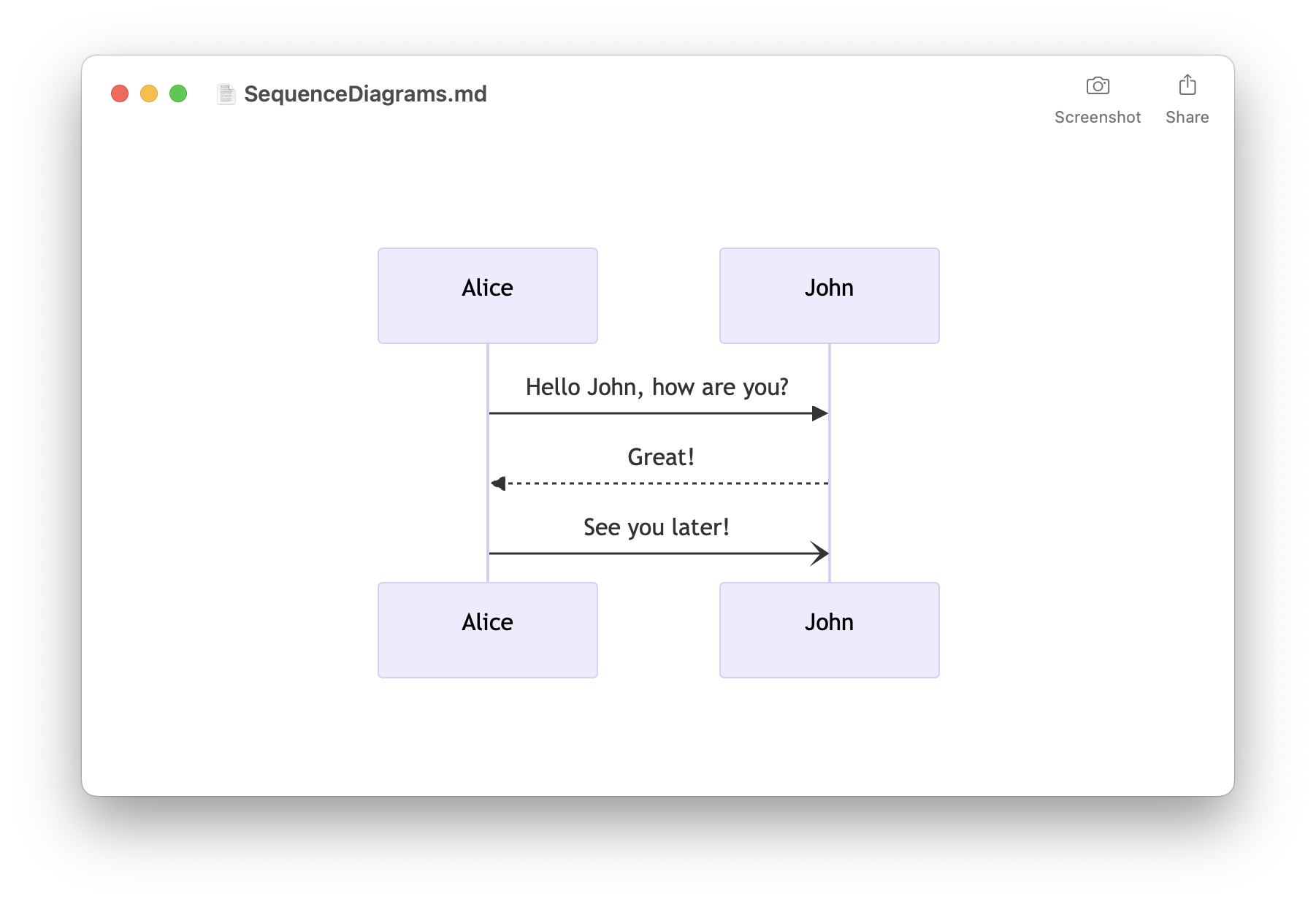
Mermaid has done a tremendous job to simplify the creation in Markdown of diagrams such as flowcharts, sequences and Gantt charts. Such diagrams are now natively supported by a large number of services and tools, including GitLab and GitHub.
But interestingly, despite Markdown’s widespread adoption, there is currently no standard for rendering line and bar charts directly within Markdown. Luckily there are powerful and open-source Javascript visualization libraries like Apache ECharts.
Previous solution
Until now, the charts visible on this blog were generated by third-party tools like Numbers.app. This involved taking a screenshot of the chart and using the resulting image in Markdown. This approach was cumbersome for several reasons:
- Managing the Numbers.app files in a separate git repository made it challenging to track changes
- Updating the data involved a time-consuming process of modifying the file, capturing a screenshot, and uploading the new image
- Modifying the style of the charts was a complex task
- Support for Light and Dark modes proved to be impractical
Switching to Apache ECharts
Apache ECharts is a powerful, interactive charting and data visualization library, available under the Apache License. Switching to Apache ECharts brought several benefits:
- Don’t rely on external tools like Numbers.app
- Make it possible to change the data without having to manually recreate the chart
- Possibility to compare commits in the repository
- Improved customization of the styles and colors
- Light and Dark modes
- Various small improvements
- Apache ECharts supports a wide range of other kinds of charts that could be useful in the future. See by yourself at https://echarts.apache.org/examples/.
Below are some examples taken for my previous post: Apple’s use of Swift and SwiftUI in iOS 16
Bar charts
In my previous blog post, you could see the following image of a simple bar chart:
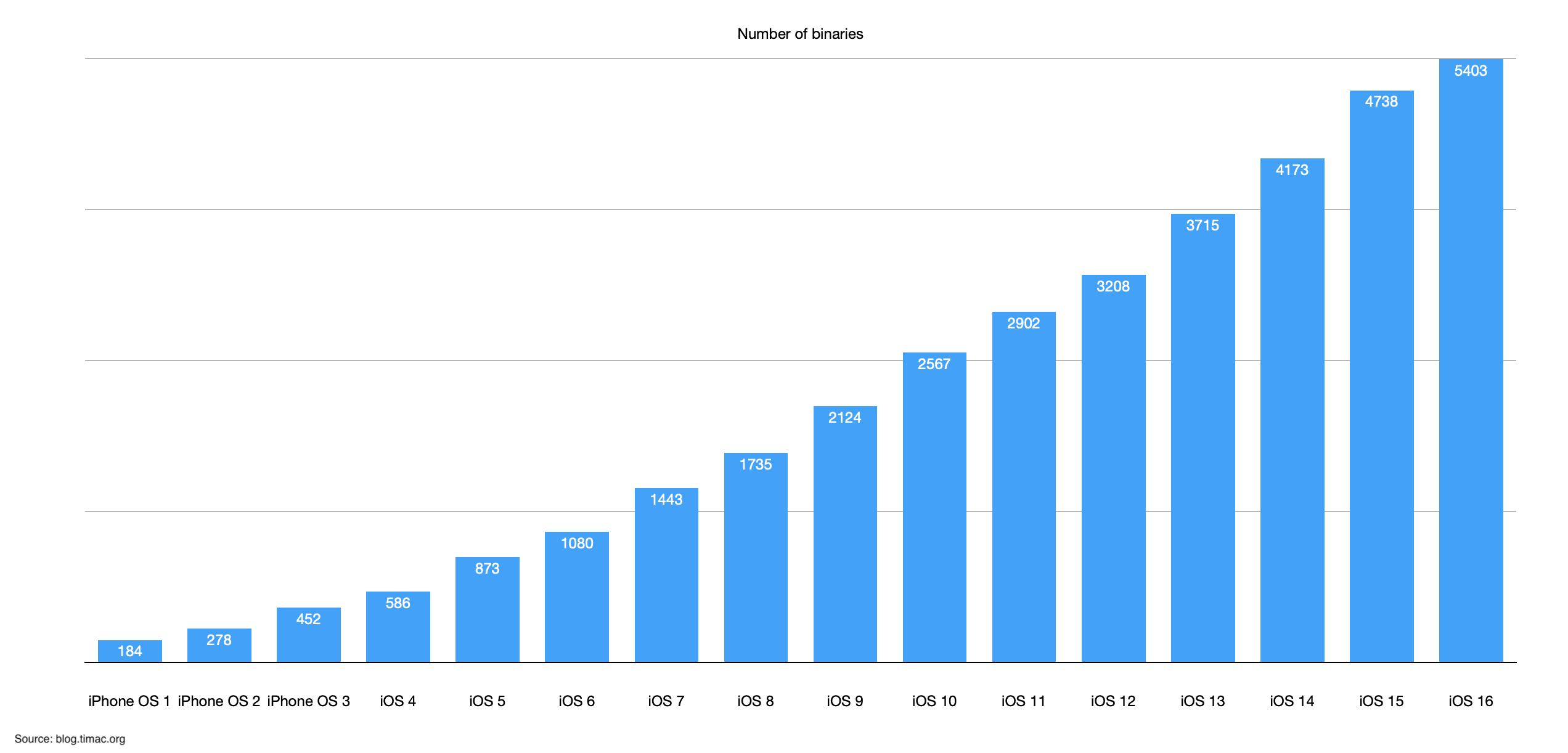
Here is the new chart created using Apache ECharts, ensuring optimal legibility, even on small screens.
The Javascript code to render this chart is straightforward, with 2 noteworthy points:
- The first part of the code handles the dynamically support for the Light and Dark modes
- The
addEventListener()line enables dynamic resizing of the chart, for example when resizing your browser’s window.
<script type="text/javascript">
	var theme = 'light';
	var backgroundColor = '#FFFFFF';
	if (window.matchMedia && window.matchMedia('(prefers-color-scheme: dark)').matches) {
		theme = 'dark';
		backgroundColor = '#323232';
	}

	var chart = echarts.init(document.getElementById('GraphNumberBinaries'), theme);
	window.addEventListener('resize', function() {
		chart.resize();
	});

	var option = {
		backgroundColor: backgroundColor,
		grid: {
			left: '60px',
			right: '10'
		},
		color: ['#01A0FA'],
		title: {
			text: 'Number of binaries',
			x: 'center',
			textStyle: {
				fontSize: 12,
				fontStyle: 'normal'
			}
		},
		xAxis: {
			axisLabel: {
				rotate: 30
			},
			data: ['iPhone OS 1', 'iPhone OS 2', 'iPhone OS 3', 'iOS 4', 'iOS 5', 'iOS 6', 'iOS 7', 'iOS 8', 'iOS 9', 'iOS 10', 'iOS 11', 'iOS 12', 'iOS 13', 'iOS 14', 'iOS 15', 'iOS 16']
		},
		yAxis: {},
		series: [
			{
				name: 'Number of binaries',
				type: 'bar',
				label: {
					show: true,
					position: 'top',
					align: 'center'
				},
				data: [184, 278, 452, 586, 873, 1080, 1443, 1735, 2124, 2567, 2902, 3208, 3715, 4173, 4738, 5403]
			}
		]
	};
	chart.setOption(option);
</script>
Bar charts with several series
Some bar charts contain multiple series, such as this graph that shows the number of binaries using Swift and SwiftUI:
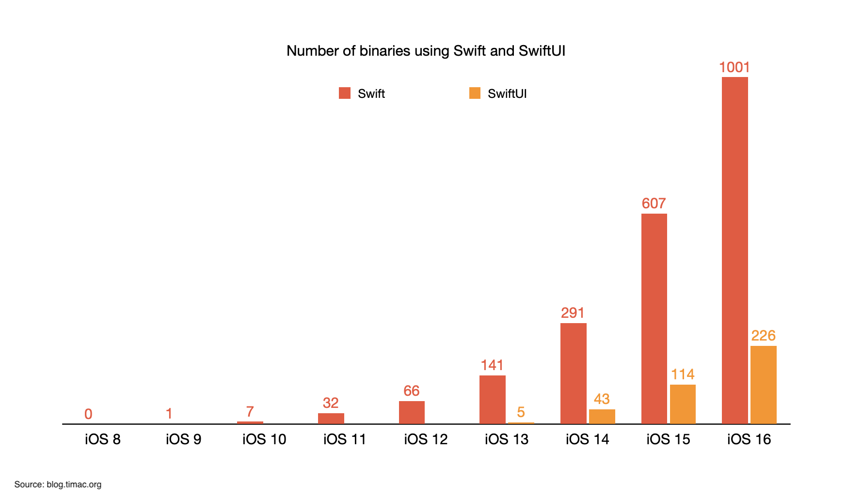
I made a few minor adjustments to the new chart to enhance its presentation and clarity:
As expected, adding a second series to the data will create the bar chart. Worth noting are the use of null to hide the value 0 and the creation of the legend:
<script type="text/javascript">
	var theme = 'light';
	var backgroundColor = '#FFFFFF';
	if (window.matchMedia && window.matchMedia('(prefers-color-scheme: dark)').matches) {
		theme = 'dark';
		backgroundColor = '#323232';
	}

	var chart = echarts.init(document.getElementById('BinariesUsingSwift'), theme);
	window.addEventListener('resize', function() {
		chart.resize();
	});

	var option = {
		backgroundColor: backgroundColor,
		grid: {
			left: '60px',
			right: '10'
		},
		color: ['#01A0FA'],
		title: {
			text: 'Number of binaries using Swift and SwiftUI',
			x: 'center',
			textStyle: {
				fontSize: 12,
				fontStyle: 'normal'
			}
		},
		legend: {
			data: ['Swift', 'SwiftUI'],
			top: 30
		},
		xAxis: {
			data: ['iOS 8', 'iOS 9', 'iOS 10', 'iOS 11', 'iOS 12', 'iOS 13', 'iOS 14', 'iOS 15', 'iOS 16']
		},
		yAxis: {
			min: 0,
			minInterval: 200
		},
		series: [
			{
				name: 'Swift',
				type: 'bar',
				label: {
					show: true,
					position: 'top',
					align: 'center',
					color: '#F05038'
				},
				color: ['#F05038'],
				data: [null, 1, 7, 32, 66, 141, 291, 607, 1001]
			},
			{
				name: 'SwiftUI',
				type: 'bar',
				label: {
					show: true,
					position: 'top',
					align: 'center',
					color: '#F48D03'
				},
				color: ['#F48D03'],
				data: [null, null, null, null, null, 5, 43, 114, 226]
			}
		]
	};
	chart.setOption(option);
</script>
Stacked Bar charts
I also frequently generate Stacked Bar charts, like this one to compare the percentages of binaries using SwiftUI and UIKit:
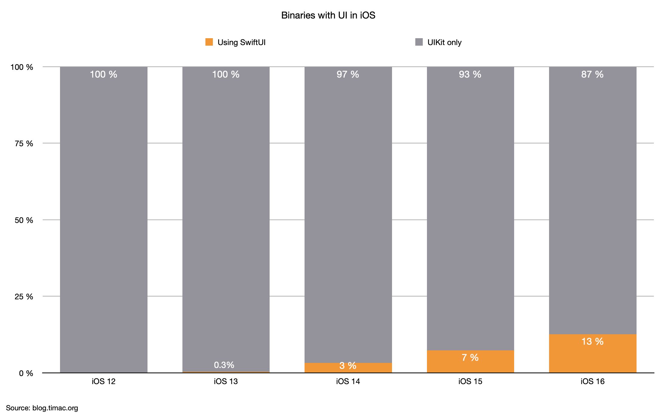
Here is the graph built using ECharts with the same data:
In the corresponding code, note the utilization of formatters for the labels. The animations are explicitly disabled to avoid an unexpected animation of the bars when the chart is display.
<script type="text/javascript">
	var theme = 'light';
	var backgroundColor = '#FFFFFF';
	if (window.matchMedia && window.matchMedia('(prefers-color-scheme: dark)').matches) {
		theme = 'dark';
		backgroundColor = '#323232';
	}

	var chart = echarts.init(document.getElementById('BinariesWithUIPercentage'), theme);
	window.addEventListener('resize', function() {
		chart.resize();
	});

	var option = {
		backgroundColor: backgroundColor,
		animation: false,
		grid: {
			left: '60px',
			right: '10'
		},
		color: ['#01A0FA'],
		title: {
			text: 'Binaries with UI in iOS',
			x: 'center',
			textStyle: {
				fontSize: 12,
				fontStyle: 'normal'
			}
		},
		legend: {
			data: ['Using SwiftUI', 'UIKit only'],
			top: 30
		},
		xAxis: {
			data: ['iOS 12', 'iOS 13', 'iOS 14', 'iOS 15', 'iOS 16']
		},
		yAxis: {
			min: 0,
			max: 100,
			minInterval: 25,
			axisLabel: {
				formatter: function (params) {
					return params + "%";
				}
			}
		},
		series: [
			{
				name: 'Using SwiftUI',
				type: 'bar',
				stack: 'bars',
				label: {
					show: true,
					position: 'top',
					offset: [0, 10],
					color: '#FFFFFF',
					formatter: function (params) {
						return params.data + "%";
					}
				},
				color: ['#FF9305'],
				data: [null, 0.3, 3, 7, 13]
			},
			{
				name: 'UIKit only',
				type: 'bar',
				stack: 'bars',
				label: {
					show: true,
					position: 'top',
					offset: [0, 20],
					color: '#FFFFFF',
					formatter: function (params) {
						return params.data + "%";
					}
				},
				color: ['#94929B'],
				data: [100, 100, 97, 93, 87]
			}
		]
	};
	chart.setOption(option);
</script>
Advanced Stacked Bar charts
I also created some complex Stacked Bar charts like this graph to visualize the evolution of the programming languages in iOS:
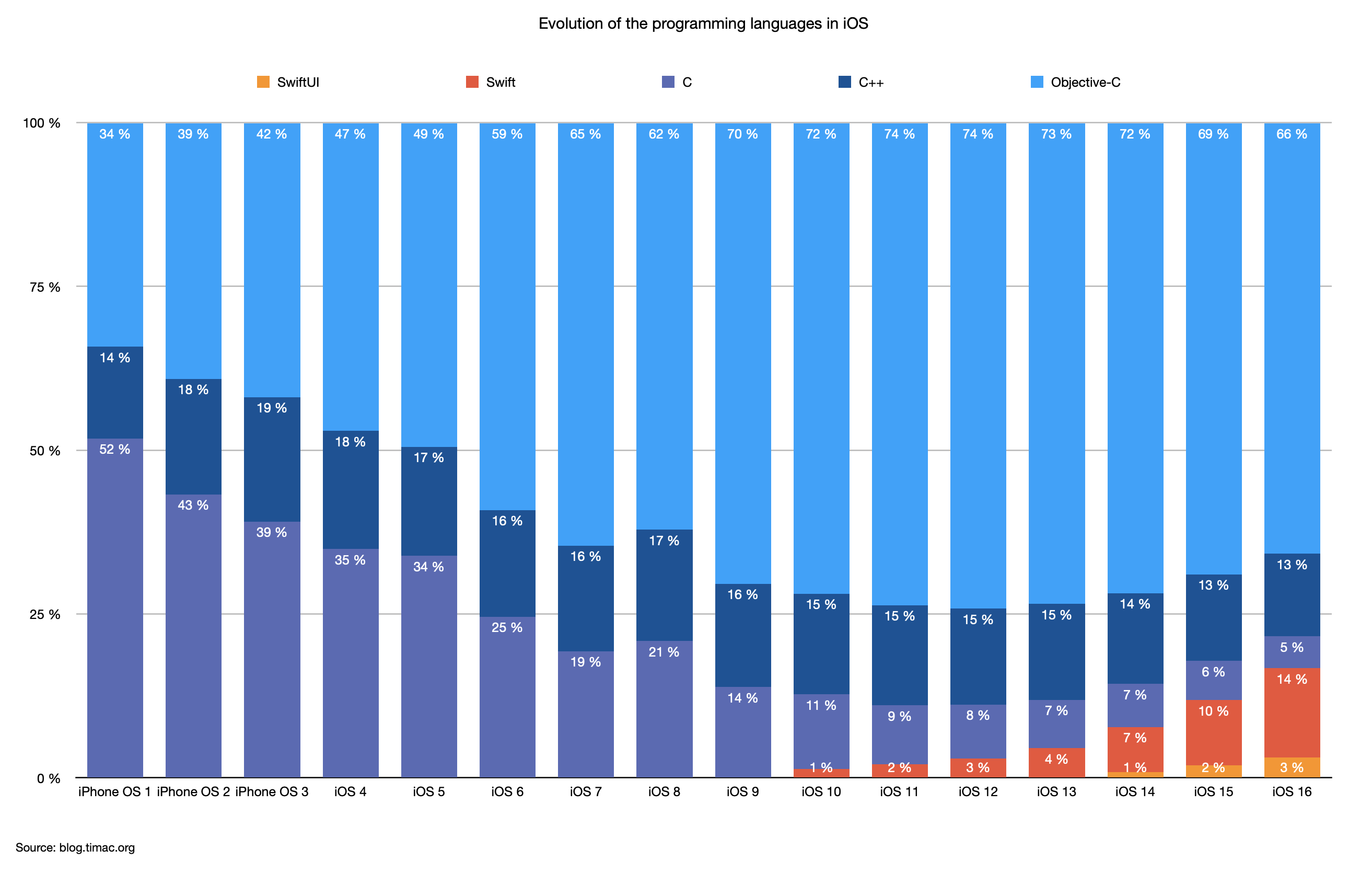
I could recreate an almost identical dynamic chart using ECharts:
Note in the code how the labels are positioned using an offset:
<script type="text/javascript">
	var theme = 'light';
	var backgroundColor = '#FFFFFF';
	if (window.matchMedia && window.matchMedia('(prefers-color-scheme: dark)').matches) {
		theme = 'dark';
		backgroundColor = '#323232';
	}

	var chart = echarts.init(document.getElementById('EvolutionProgrammingLanguagesPercentage'), theme);
	window.addEventListener('resize', function() {
		chart.resize();
	});

	var option = {
		backgroundColor: backgroundColor,
		animation: false,
		grid: {
			left: '60px',
			right: '10'
		},
		color: ['#01A0FA'],
		title: {
			text: 'Evolution of the programming languages in iOS',
			x: 'center',
			textStyle: {
				fontSize: 12,
				fontStyle: 'normal'
			}
		},
		legend: {
			data: ['SwiftUI', 'Swift', 'C', 'C++', 'Objective-C'],
			top: 30
		},
		xAxis: {
			axisLabel: {
				rotate: 30
			},
			data: ['iPhone OS 1', 'iPhone OS 2', 'iPhone OS 3', 'iOS 4', 'iOS 5', 'iOS 6', 'iOS 7', 'iOS 8', 'iOS 9', 'iOS 10', 'iOS 11', 'iOS 12', 'iOS 13', 'iOS 14', 'iOS 15', 'iOS 16']
		},
		yAxis: {
			min: 0,
			max: 100,
			minInterval: 25,
			axisLabel: {
				formatter: function (params) {
					return params + "%";
				}
			}
		},
		series: [
			{
				name: 'SwiftUI',
				type: 'bar',
				stack: 'bars',
				label: {
					show: true,
					position: 'top',
					offset: [0, 15],
					color: '#FFFFFF',
					fontSize: 9,
					formatter: function (params) {
						return Math.round(params.data) + "%";
					}
				},
				color: ['#F48D03'],
				data: [null, null, null, null, null, null, null, null, null, null, null, null, null, 44*100/5107, 114*100/6083, 226*100/7331]
			},
			{
				name: 'Swift',
				type: 'bar',
				stack: 'bars',
				label: {
					show: true,
					position: 'top',
					offset: [0, 15],
					color: '#FFFFFF',
					fontSize: 9,
					formatter: function (params) {
						return Math.round(params.data) + "%";
					}
				},
				color: ['#F05038'],
				data: [null, null, null, null, null, null, null, null, null, 40*100/2895, 69*100/3307, 108*100/3691, 194*100/4385, 351*100/5107, 607*100/6083, 1001*100/7331]
			},
			{
				name: 'C',
				type: 'bar',
				stack: 'bars',
				label: {
					show: true,
					position: 'top',
					offset: [0, 15],
					color: '#FFFFFF',
					fontSize: 9,
					formatter: function (params) {
						return Math.round(params.data) + "%";
					}
				},
				color: ['#5967B6'],
				data: [100*100/193, 135*100/312, 196*100/501, 225*100/644, 322*100/950, 290*100/1180, 305*100/1577, 401*100/1920, 325*100/2352, 329*100/2895, 297*100/3307, 305*100/3691, 323*100/4385, 337*100/5107, 365*100/6083, 357*100/7331]
			},
			{
				name: 'C++',
				type: 'bar',
				stack: 'bars',
				label: {
					show: true,
					position: 'top',
					offset: [0, 15],
					color: '#FFFFFF',
					fontSize: 9,
					formatter: function (params) {
						return Math.round(params.data) + "%";
					}
				},
				color: ['#025198'],
				data: [27*100/193, 55*100/312, 95*100/501, 116*100/644, 158*100/950, 192*100/1180, 254*100/1577, 326*100/1920, 371*100/2352, 445*100/2895, 505*100/3307, 540*100/3691, 643*100/4385, 708*100/5107, 802*100/6083, 923*100/7331]
			},
			{
				name: 'Objective-C',
				type: 'bar',
				stack: 'bars',
				label: {
					show: true,
					position: 'top',
					offset: [0, 15],
					color: '#FFFFFF',
					fontSize: 9,
					formatter: function (params) {
						return Math.round(params.data) + "%";
					}
				},
				color: ['#01A0FE'],
				data: [66*100/193, 122*100/312, 210*100/501, 303*100/644, 470*100/950, 698*100/1180, 1018*100/1577, 1193*100/1920, 1655*100/2352, 2081*100/2895, 2436*100/3307, 2738*100/3691, 3221*100/4385, 3667*100/5107, 4195*100/6083, 4824*100/7331]
			}
		]
	};
	chart.setOption(option);
</script>
Line charts
This image shows the number of binaries using UIKit and SwiftUI:
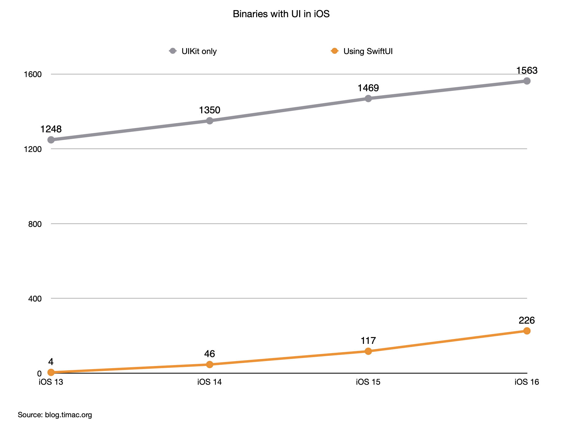
Obviously Echarts supports line charts:
In the source, note the type of the series to display lines:
<script type="text/javascript">
	var theme = 'light';
	var backgroundColor = '#FFFFFF';
	if (window.matchMedia && window.matchMedia('(prefers-color-scheme: dark)').matches) {
		theme = 'dark';
		backgroundColor = '#323232';
	}

	var chart = echarts.init(document.getElementById('BinariesWithUI'), theme);
	window.addEventListener('resize', function() {
		chart.resize();
	});

	var option = {
		backgroundColor: backgroundColor,
		grid: {
			left: '60px',
			right: '10'
		},
		color: ['#01A0FA'],
		title: {
			text: 'Binaries with UI in iOS',
			x: 'center',
			textStyle: {
				fontSize: 12,
				fontStyle: 'normal'
			}
		},
		legend: {
			data: ['UIKit only', 'Using SwiftUI'],
			top: 30
		},
		xAxis: {
			data: ['iOS 13', 'iOS 14', 'iOS 15', 'iOS 16']
		},
		yAxis: {
			min: 0,
			minInterval: 500
		},
		series: [
			{
				name: 'UIKit only',
				type: 'line',
				label: {
					show: true,
					color: '#94929B'
				},
				color: ['#94929B'],
				data: [1248, 1350, 1469, 1563]
			},
			{
				name: 'Using SwiftUI',
				type: 'line',
				label: {
					show: true,
					color: '#F89002'
				},
				color: ['#F89002'],
				data: [4, 46, 117, 226]
			}
		]
	};
	chart.setOption(option);
</script>
Advanced Line charts
The following image displays a chart with 5 series:
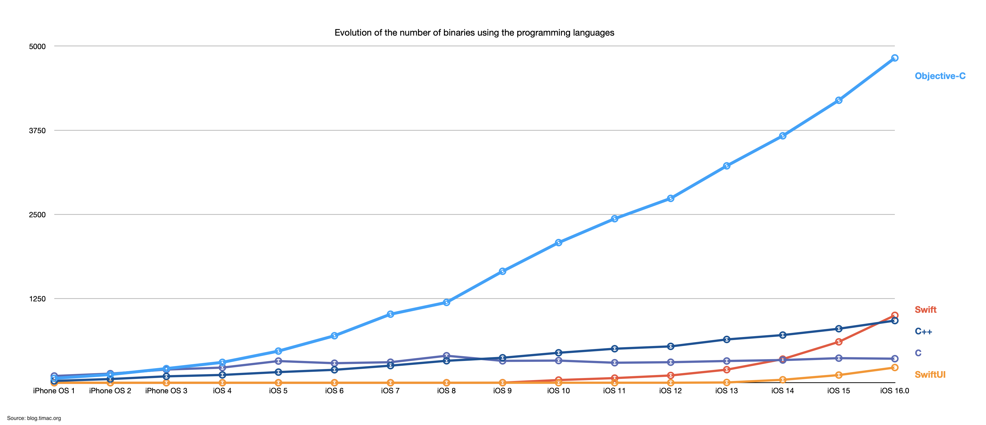
For legibility, I rotated the labels on the x axis when rendering the graph with ECharts:
In the source, see how the labels are rotated and how the interval for the y axis is specified:
<script type="text/javascript">
	var theme = 'light';
	var backgroundColor = '#FFFFFF';
	if (window.matchMedia && window.matchMedia('(prefers-color-scheme: dark)').matches) {
		theme = 'dark';
		backgroundColor = '#323232';
	}

	var chart = echarts.init(document.getElementById('EvolutionProgrammingLanguages'), theme);
	window.addEventListener('resize', function() {
		chart.resize();
	});

	var option = {
		backgroundColor: backgroundColor,
		color: ['#01A0FA'],
		title: {
			text: 'Evolution of the number of binaries using the programming languages',
			x: 'center',
			textStyle: {
				fontSize: 12,
				fontStyle: 'normal'
			}
		},
		xAxis: {
			axisLabel: {
				rotate: 30
			},
			data: ['iPhone OS 1', 'iPhone OS 2', 'iPhone OS 3', 'iOS 4', 'iOS 5', 'iOS 6', 'iOS 7', 'iOS 8', 'iOS 9', 'iOS 10', 'iOS 11', 'iOS 12', 'iOS 13', 'iOS 14', 'iOS 15', 'iOS 16']
		},
		yAxis: {
			min: 0,
			minInterval: 1000
		},
		series: [
			{
				name: 'SwiftUI',
				type: 'line',
				label: {
					show: false
				},
				endLabel: {
					show: true,
					color: '#F48D03',
					formatter: function (params) {
						return "SwiftUI";
					}
				},
				color: ['#F48D03'],
				data: [0, 0, 0, 0, 0, 0, 0, 0, 0, 0, 0, 0, 4, 44, 114, 226]
			},
			{
				name: 'Swift',
				type: 'line',
				label: {
					show: false
				},
				endLabel: {
					show: true,
					color: '#F05038',
					formatter: function (params) {
						return "Swift";
					}
				},
				color: ['#F05038'],
				data: [0, 0, 0, 0, 0, 0, 0, 0, 1, 40, 69, 108, 194, 351, 607, 1001]
			},
			{
				name: 'C',
				type: 'line',
				label: {
					show: false
				},
				endLabel: {
					show: true,
					color: '#5967B6',
					formatter: function (params) {
						return "C";
					}
				},
				color: ['#5967B6'],
				data: [100, 135, 196, 225, 322, 290, 305, 401, 325, 329, 297, 305, 323, 337, 365, 357]
			},
			{
				name: 'C++',
				type: 'line',
				label: {
					show: false
				},
				endLabel: {
					show: true,
					color: '#025198',
					formatter: function (params) {
						return "C++";
					}
				},
				color: ['#025198'],
				data: [27, 55, 95, 116, 158, 192, 254, 326, 371, 445, 505, 540, 643, 708, 802, 923]
			},
			{
				name: 'Objective-C',
				type: 'line',
				label: {
					show: false
				},
				endLabel: {
					show: true,
					color: '#01A0FE',
					formatter: function (params) {
						return "Objective-C";
					}
				},
				color: ['#01A0FE'],
				data: [66, 122, 210, 303, 470, 698, 1018, 1193, 1655, 2081, 2436, 2738, 3221, 3667, 4195, 4824]
			}
		]
	};
	chart.setOption(option);
</script>
Light and Dark mode
One reason to switch to Echarts was to support Dark mode, which is possible thanks to the different themes available.
A chart can be rendered in Light mode:
Or dark mode:
- Easily preview DOT diagrams
- Live update when editing
- Capture screenshots
- Quick Look integration
- Free download on the Mac App Store
Conclusion
Switching to Apache ECharts has brought several benefits. There are however some potential downsides:
- Replacing static images with dynamic charts introduces a dependency on an external library, which may require additional maintenance and updates
- This blog now requires Javascript to display the charts
- Apache ECharts is currently not natively supported by the different services and tools
- Loading external JavaScript libraries introduces a potential security risk
- Creating OG images for social media sharing still requires some manual effort
While Apache ECharts is a great solution for my use case, I hope to see in the future a standard to create charts in Markdown.